Monday, March 14, 2011

AM Class 1 - Week 9

This week we learned about exaggeration and weight. We really focussed mostly on exaggeration with a side helping of weight, so I won't be talking about weight much. On to exaggeration!

So, even you non animators out there understand what exaggeration means. It's that thing your girlfriend does when she says she told you to do something a hundred times, but really she only told you once. But in animation we use exaggeration for much more awesome purposes. We generally use exaggeration to either A) create a certain style, like being really cartoony and breaking the laws of physics, or B) making things clearer for the audience. Actually, we always do "B" and sometimes do "A" if that's what we want. That's right, we actually exaggerate to make everything easier to see and understand for the audience. Because if you animate something exactly as it's done in real life, it actually doesn't look very good. I know, it's weird. So we exaggerate poses, timing, pauses, character traits, personality, actions, and even ideas. All for the purpose of making our animation both interesting to watch, and easy to follow. We make sure you're looking right where we want you to by exaggerating what's happening on that part of the screen, or scene, or look on the character's face.

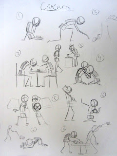
Unfortunately, we didn't really get to do any real exaggerating on our animation this week since we are just finishing up the Vanilla Walk from last week. We DID however get to practice exaggeration on our poses for this week; which was to portray concern. Honestly, it was pretty tough to come up with non cliche poses that show concern, but I think I decided on a pretty good one. I actually came up with it last minute, and chose to do it because both characters are showing different types of concern, which I thought was pretty cool.

Walking the Walk


Pose ideas.

The pose.

Friday, March 11, 2011

AM Class 1 - Week 8

Ahh, week 8. That was a sigh of relief "ahh," and not an "OH SHIT, AAAAHH!" Because I have a wonderfully short post this week, and yes, it's actually going to be super short. This week was our introduction to Walks. More specifically, the everyday, standard walk which we like to call the Vanilla Walk. There's really no attitude or character in it. It's just a normal walk. The only other thing I will say about it is that it usually consists of 5 major poses: the contact, the down pose (in which the weight shifts from the back leg to the front), the passing pose, the up pose, and the contact again.

This week all we had to do was the blocking, which is just those 5 poses. So the animation is going to look a little choppy, but it's supposed to at this point. We also had to do a pose that showed strength. I picked kind of a classic, Atlas type pose. Check it out.

Planning for the walk.


Here's the walk animation.


Here's all my strength pose ideas.


And here's the final pose.

Friday, March 4, 2011

AM Class 1 - Week 7

Alrighty everyone, so I'm almost 3 weeks late on this one, but the good new is that it's going to be extremely short for Week 7. Our lecture this week was all about the wonderful and extremely tedious art of spline editing. For those of you who aren't familiar with 3D animation and have no idea what spine editing is I'll try to break it down for you. This might get nutty though.

On every character there are many controls that allow me to move the character into whatever position I want. There are feet controls, hand controls, spine controls, head and neck controls, and basically controls for every joint you can think of. Normally what I do with these controls is use them to either MOVE something or ROTATE something. There are also other things I can do with some of the controls but that gets all complicated, so lets just pretend they don't exist for a second. Now, since we're dealing with 3 dimensions it means I have three axis I can MOVE things in: up-down, left-right, and forward-backward. The ROTATION is a little more complicated, but it's the same principle: three axis that I can rotate in.

Hopefully I haven't lost you yet. Ok, so every time I move or rotate any of the controls on the character and set a key on it, Maya (the program we use) saves the position of the control on each axis. Maya then creates a graph of each axis, for every control that I've keyed. So on each control I get a graph of the up and down motion, the left and right, the backward and forward, the x rotation, the y rotation, and the z rotation. That's 6 graphs for every control on the character (mind you, some controls have more options and some have less). I'm not going to lie, it's a metric shit-ton of graphs to deal with.

The cool thing is, we can look at each graph and manipulate the keys we've set on it as well as manipulate how Maya interpolates between those keys. This is an absolutely necessary step in making sure your animation isn't crappy. And that's what spline editing is: fudging the graphs.

So once again I've lied right to your faces and said that this was going to be a short post. But as fate would have it, it was long and possibly too complex to understand. A+ job Matt.

Our assignment this week was to sketch and animate a ball with a tail bouncing a minimum of 3 times. It was a pretty cool assignment, and whenever you can get something like the a tail to flow nicely it makes you feel good as an animator. Here's my stuff.


Monday, February 14, 2011

AM Class 1 - Week 6

So this week was all about overlapping action, which is another principle that helps your animation stop looking mechanical or stiff. The principle of overlapping action basically says, "Not everything happens at the same time, dude. One thing will start moving, then the next thing will and then the next. Or one thing will stop, like your body, but your head and hands and clothes and hair may keep moving forward for a second before they settle. And they all probably won't settle at the same time."

This sounds like a simple enough principle, but it can be really difficult to make look believable, and it can be easily overlooked when your working in a pose to pose method where everything is keyed on the same frame. Not to mention, there's a ton of different ways to go about adding overlapping action into your shot. You could do it using breakdowns, or by offsetting keys, or by layering your animation by starting at the base and working your way up a chain, etc. There's lots of freedom in how you do it and that will affect what it looks like in the end.

Our assignment this week was to plan out a animation of a pendulum with three links in it, and then of course, to animate it. It wasn't quite that simple though. The base of the pendulum had to start and stop moving, and we had some freedom in how it moved. There were a lot of creative ideas I saw other students do, but I decided to stick with the school's suggestion of just doing a figure-eight motion. I think I'm going to try to be more creative with my assignments in the future. I've been doing the simple ones so far for a reason though: These assignments are meant to hammer in the basics so we learn how to animate well; they aren't exercises in creativity, they're exercises in mechanics; they're not going on my demo reel, they simply serve to teach me how to animate different types of motion. It's like, doing a sit-up at the gym in some oddly creative way isn't going to build any more muscle than doing a plane old, vanilla sit-up. In fact, the creative process may take away from what you're really supposed to be focusing on, which is the simple mechanics of doing a proper sit-up. That said, there is something about being creative even on the simple stuff that appeals to me. So I'll try to make these a little more entertaining and creative from here on out. For now, here's my pendulum animation.

This is the planning I drew out before actually animating.


Here's the animation.

Tuesday, February 8, 2011

AM Class 1 - Week 5

Well hello everybody. Week 5 just passed at Animation Mentor and our topic of study was Anticipation and Squash & Stretch. Our assignment was to animate a bouncing ball (yes, another bouncing ball) that goes through an obstacle course, as well as create a pose that conveys Devastation. Oh, and the bouncing ball will now have squash and stretch applied to it.

But Matt, what is Squash & Stretch? Funny you should ask, as I was just about to explain them. It's a simple enough concept to understand: things squash, and things stretch. But we're not just talking about the skin on you arm when you rest it on a table, or the muscle of your butt-cheeks when you sit down. Entire actions can be defined by squashing or stretching or both. For example, if your standing and you want to jump in the air, what do you do? You squat down (squash) and then you straighten out as you leap into the air (stretch). A bouncing ball will squash as it hits the ground, then slightly stretch out as it leaves the ground (this is often greatly exaggerated in animation to be more clear). Squash and stretch happens everywhere, even when you don't exactly notice. Even a pitcher throwing a baseball squashes up as he starts the pitch, then stretches out upon throwing the ball. I bet you never thought of that, did you? (Neither did you until they showed me).

Ok Matt, I get it, but what about Anticipation? Isn't that the feeling you get on Christmas morning right before you see all the loot you got? Yes, yes it is. But it's not quite the same in animation. Anticipation for the animator is the building up of energy in order to perform an action. Sometimes it's shown as moving backward before moving forward, or shifting your weight to the left before you step to the right. It's kind of a movement before a movement. A golfer swings back before swinging forward, a pitcher winds up before throwing a baseball (anticipation and squash), you scrunch down before you jump up. We use it because things don't look right without it, and it clarifies the primary action that's about to take place. Could you imaging a golfer just swinging the club forward? It would probably look pretty weird and it wouldn't be too effective. These are obvious examples, but anticipation happens everywhere on both small and large scales. Sometimes so minutely that you don't even really see it, it just 'feels' better than it does without it.

I could go on for a while about Anticipation and it's uses, but I think you get the picture. So on to the assignments. I unfortunately had to rush a little bit to get through these because I was travelling from Friday through Sunday, so I definitely think there will be some revisions.

Here' is my planning for my obstacle course.


Here's the animation.


Here's the planning for my pose. I chose #4 and put it at a different angle for clarity and feel.


And here's the actual pose.

Sunday, January 30, 2011

AM Class 1 - Week 4

Alrighty everyone, this week's going to be a little bit shorter because, well, because I'm tired. Our lecture was on timing and spacing and what those two words really mean to animators. To be honest, they're still a little bit fuzzy in my head but it's kind of because they go hand in hand.

Timing as I understand it is how long an action takes, which seems simple enough. Spacing is how far apart your drawings are from frame to frame. So if your drawings are spaced far apart then your object is going to look like it's moving really fast across the screen. But if your drawings are spaced close together then the object is moving slowly.

It gets a little confusing because how much time you give an object to get somewhere effects the spacing of the drawings. Also, the spacing of your drawings really changes everything about the action. You could have a slow in, a slow out, acceleration out or in, an arc or straight line, etc. If either your timing or your spacing is off, it can really make the animation look weird or confusing or just wrong.

I guess those two concepts aren't too difficult after all, but you can often fiddle with either the timing or the spacing to make something look right. For instance, if we consider one bounce of a basket ball: if I change how high the ball bounces, it effects the spacing of the drawings throughout the entire bounce. Or, I could give the ball more or less time to bounce which also affects the space of the drawings throughout the bounce. Sometimes it's hard to decide which one you need to change.

Alright enough of that jazz. This week's assignment was to plan out and animate two bouncing balls. One light, and one heavy. We could also make revisions to last week's assignment.

So here's my planning. I decided to go with the top one of a beach ball and a bowling ball.


And here's the animation.


And last but not least, here's the revision of my excitement poses. The first is the old one and the second is the revised version.


I lied, this week's not any shorter.

Sunday, January 23, 2011

AM Class 1 - Week 3

So week 3 has come and gone at Animation Mentor, and I must say it was a pretty cool week. Our lecture was all about planning and blocking a shot and the various ways to do so. I've realized (although it seems obvious now) that a ridiculous amount of planning is required for each shot. Planning allows you to refine and explore different acting choices, key poses, timing, beats, and a whole slew of things that we won't touch on until later. I think that the lack of serious planning has probably been one of my biggest hindrances in my animation. I think Shawn Kelly said that if you really plan your shot well and you've thumbnailed everything out, then all your work on the computer will be much easier since you'll already have all your keys and breakdowns on paper. You won't have to make anything up as you go along, and your poses will be kickass.

So our assignment this week was to plan out a bouncing basketball and the animate the bouncing ball. We also had to draw a bunch of different poses that conveyed excitement, and then pose our Stu rig in that pose.

I have to admit that the animation of the ball bounce took me a lot longer than I originally expected. After first attempt I got a few comments that it looked a little more like a ping pong ball because the bounces were too high, and also that there were too many bounces. So I went ahead and made the necessary changes and I think it worked out well.

The excitement poses were also somewhat difficult to come up with because it was hard not to be completely cliche. I think at least half of the ones I drew were, but I think I found a good one in the end. I'll find out during my eCritique.

So here's the planning for the bouncing ball.


And here's the Animation.


Here are my sketches for the pose.


Here's the pose in all 3 dimensions ladies and gentlemen.


Oh, and I was able to do a revision of last weeks pose, so here's what I came up with after my mentor's advice.

Sunday, January 16, 2011

AM Class 1 - Week 2

This week was pretty cool because we got our first real assignment, and I got to find out more about how AM works.

Our lecture was on the 12 principles of animation and really just touched what each of them are without diving in too heavily. We aren't required to know how to really apply them yet (since we haven't done any animation), but we should now be familiar with them and what they're talking about. And we should be keeping them in the back of our minds. We also learned a little about using silhouettes to make sure our poses aren't cluttered, and our mentor touched on line of action.

Our assignment was to go out and sketch people wherever we wanted, then to pick a pose that we drew (and liked) and to recreate it using our character, Stu. We then posted our sketches as well as our pose for our mentor to critique. The sketches didn't have to be more than stick figures, but the goal is for them to be clear. The 3D pose itself was also supposed to be clear.

So what we do is either submit our work early in the week or post it in our public review section. Either way other students will be able to drop by during the week and give you advice on your work, and it is highly encouraged for you to do the same to other student's work. After all, the student advice is like half of what makes up AM. There are also other mentors that will come by and give you some advice if you ask for it in the forums. You can then change your submitted work with the new stuff you've been working on all week, all the way up until the deadline for the assignment.

After the deadline our mentor will then come and grade the assignments as well as give his eCritique. It's then up to us to go back and change our work according to his advice in the next week (while also working on the next assignment). Any revisions we make won't change the grade, but it's always good to go make the changes anyway so you really understand them.

So I picked a coffee shop to draw in and it probably wasn't the best place to go. There are simply too many people sitting around, not doing much. It's a great place if you want to see how different people sit or pour their coffee, but if you want exciting, dramatic poses you should probably head somewhere else. So after filling 2 pages of my sketchbook I went home to figure out which I wanted to pose. I picked 3 I liked, and to make a long story short, I ended up choosing an entirely different pose to turn in because the other one's we just kind of bleh. It was good practice though and I'm looking forward to my eCritique.

One of the original 3. I almost turned this in.


Here's actually a 4th pose I did.


And here's the one I decided to turn in.

Sunday, January 9, 2011

AM Class 1 (Basic Foundations) - Week 1

The first week at AM is over and I have to say that it was an exciting week. It was pretty normal as far as first weeks go in that it was all about orientation and getting to know people.

I got assigned my mentor, Paul Allen. He's mentoring 15 other students besides me who are all in the same class (Basic Foundations). We all had our first online-live Q&A with him in which we got to meet him and say hello to each other via webcam. It was definitely a cool experience being up on cam in front of everyone and getting to meet them all face to face (so to speak). Paul seems like a really awesome guy and I look forward to getting to know him more and receiving his critiques on my work, and soaking up his vast animation knowledge.

As I said, this week was all about orientation and consisted of watching a lot of videos and exploring the website. I was actually quite impressed with how many videos there are explaining everything. They have general videos telling you how to view your lecture and assignments, ones on basic and intermediate Maya skills, videos about student's workflows, and even some student examples of things like walks and turns.

They also have a section on recommended reading, character downloads, and tool downloads. They different characters become available to download once they are required for an assignment, which means I probably won't get access to their famous Bishop rig until class 2 or 3. Maybe even class 4. As of right now the only character available is Stu, who is a simple biped with no face. I have to use him for my Week 2 assignment so hopefully I will post a picture of him then.

My assignment this week was simply to set up my school profile and upload a picture, so nothing exciting to talk about quite yet.

See you next week!

Animation Mentor!!!

So a while ago I was accepted into the Animation Mentor program, which is an online school for animation. It was founded by 3 professional animators with the intentions of teaching people how to animate on a professional level. According to the founders, they designed the courses the way they would like to be taught animation if they had to go back and do it all over again. And after looking at the course outlines, I think they nailed it.

I was, and am still, very excited about the program, and I'm excited to have begun my second step in becoming a professional animator. So, I've decided to at least attempt to put up a weekly outline/review of what I've been doing at AM so that my friends can see what I'm up to.

Please note that I will not be putting up any of the actual reviews or videos that Animation Mentor provides because that is against their school policy and will get me swiftly booted from their program. I may, however, be able to put up some of my own work that I have done as assignments.